

A NEW CHURCH THAT NEEDED A CONSISTENT AND COHESIVE BRAND FOR THEIR UNIQUE STORY
Client | Harvest Light Baptist Church
Industry | Non-Profit, Church
Created | March 2018
Project Duties | Art Direction, Web Design, Branding, Print Management, Print Design
The client had recently formed their church and needed brand direction from the ground up. The end result was a cohesive brand carried through their logo, stationery suite, website, and church store items.
Testimonial | Pastor Taylor Hodges
“Lauren was great. We needed a website quick! She went to work developing ideas and putting things together for our church fast. We started from scratch. Her ideas for logos were targeted to who we are as a church and to the image we want to project to our community.
Working with Lauren was a joy. Her response time was really fast and she encouraged questions and provided options. All through the development process Lauren was there to guide us.
Education is part of what Lauren does. She helped us understand not only what our options were but how it would work on the website and what it would look like to our viewers. She taught us about integration with social media and set all of that up for us as part of her work.
I recommend Lauren to my friends who are looking to rebrand or begin a new website.”
The client wanted a clean contemporary design with a touch of traditional religious references. During our branding discussion, it was clear the logo needed to represent the church’s passions and beliefs. The logo also needed to have rich meaning and symbolism.
The Harvest Light Baptist Church logo depicts a cross within threshed wheat. It symbolizes that Jesus, the cross, is the center of the Harvest. From the center, He radiates the bounty that is offered to all. The red drop, pointing toward the heavens, at the top of the logo symbolizes the blood of Jesus. “...No man cometh unto the Father, but by me.”Just as rain provides life, the blood of Jesus provides eternal life.
The colors selected for Harvest Light Baptist Church's logo were purposefully chosen through research of color symbolism and meaning throughout history.
Purple - Royalty, The Risen King
Golden Yellow - Glory of God, Bounty, Light, Radiance, Faith, Joy
Crimson Red - Blood of the Lamb, Forgiveness, Hope, Love of God
A beautiful stationery suite was also created. The design is clean and contemporary with simple pops of color pulled from the logo. You can see the overall brand and design is cohesive throughout.
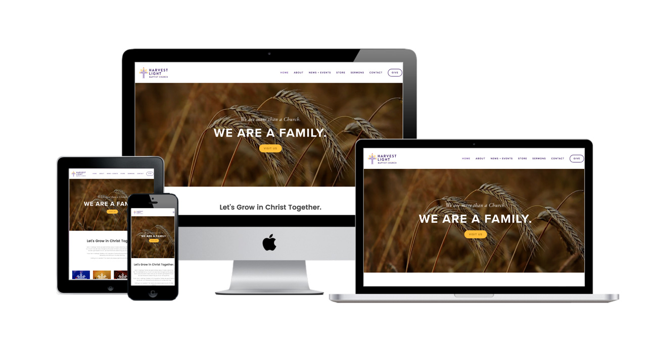
Site Features | Video Header, Twitter Feed, Instagram Feed, Sermon Podcast Integration with Setup, Blog, Event Calendar, Church Store (eCommerce), Contact Form, Donation integration
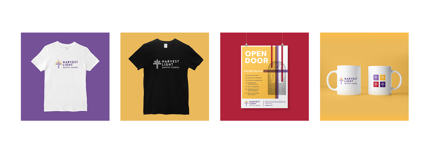
A church store was built directly into the website. This was a feature that gave donators the option to purchase branded products that helped support the growth of the church.